

UX SEO is a term marketers use to show the combination of search engine optimization and user experience. If you think about it, these two fields are closely connected. The way people move through your site, how long they stay, and what they do next, UX influences all of it. And these engagement signals shape how Google ranks your website pages.
In this article, we’ll show you how search engines measure the page experience on your site and how your design choices impact both rankings and user behavior. You’ll also learn a few UX SEO best practices to make your site work better for people, so you can see better performance in organic search results.
- Scroll depth, time on page, and interaction behavior all help Google evaluate how useful your content is.
- Core Web Vitals are part of Google’s ranking system, which are used to measure the experience people have on your site.
- Common user experience mistakes that can lead to less engagement are keyword stuffing, excessive interactive elements, and hidden CTAs.
- In international markets, UX has to match local habits. Your layouts, labels, and browsing patterns need to align with cultural expectations and what users in each country are used to seeing on a page.
What Does Google Mean by “Page Experience”?
Page Experience refers to a set of measurable signals Google uses to evaluate how usable your pages are for real people. Let’s look at them in more detail below.
Core Web Vitals as Measurable UX Signals
Google’s Core Web Vitals (CWVs) are at the center of how it evaluates page experience. These are three specific ranking signals that reflect how your website performs for users:
- Largest Contentful Paint (LCP): How long it takes for the main content on your page to load. Google recommends keeping this under 2.5 seconds.
- Interaction To Next Paint (INP): How quickly your page responds when someone tries to interact with it. This should be less than 200 milliseconds.
- Cumulative Layout Shift (CLS): How stable your page layout is when loading. A good score is less than 0.1.
In addition to CWVs, Google also looks at mobile-friendliness, HTTPS security, and any intrusive pop-ups that might block content. These are all part of what Google calls “page experience signals.”
Page Experience vs. User Experience: What’s the Difference?
These two might seem the same at first glance, but they are different. Here’s how:
- Page experience is Google’s way of scoring specific technical factors like speed, responsiveness, and visual stability.
- User experience (UX) is broader and includes design, navigation, content structure, accessibility, and how well your site meets user needs.
In other words, if you hit the benchmarks for Core Web Vitals, it doesn’t automatically mean your site offers a great experience. You can have perfect load times and still lose visitors if your navigation and overall design seem confusing.
Still, both matter for SEO. One helps you meet Google’s technical standards, and the other keeps people on your site longer and invites them to read your content, click through your pages, and eventually convert.
Keep in mind, page experience supports rankings, but it doesn’t replace relevance. Google still ranks content based on how well it answers the search intent. So even though great experience helps, it works best when combined with useful and relevant content.
Why Is UX Important for SEO?
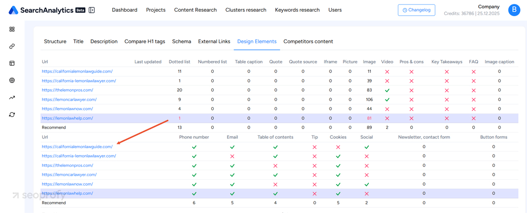
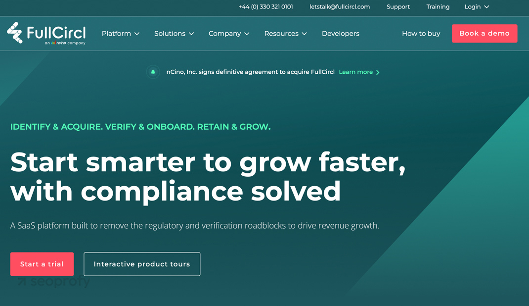
Good UX and well-placed design elements help people use your site the way they expect. They find what they’re looking for faster, click through your content, and spend more time on your site. As shown in the image below, sites with strategic design elements like visible phone numbers, emails, and tables of contents improve user trust and navigation. Key UX signals support stronger SEO performance and can give you a competitive edge in rankings.
There are also other reasons why user experience is important. Let’s look at them below.
Improves Conversion Rates
One of the biggest benefits of intuitive navigation is higher conversion rates. When your visitors have a seamless experience on your site, they scroll, click, and complete the action you want them to take.
Time4Sleep, for example, used heatmaps and customer journey tools to rethink their UX decisions. They went on to improve layout and navigation on mobile devices, which helped them increase mobile conversions by 63%.
And they aren’t the only ones. Many other businesses report similar gains after making small design improvements that help people complete their journey.
Affects Bounce Rate, Dwell Time, and Search Rankings
As mentioned earlier, search engine algorithms look at certain user engagement metrics to understand how visitors interact with your site. The longer they stay and browse your web pages, the more positive signals they send, which can influence your search rankings in the long run.
At the same time, when you make UX choices based on heatmap data and the way people move through your site, it helps create an experience that lowers bounce rates. This also increases the chances visitors will continue their journey or move on to other relevant pages.
Helps with Micro-conversions, Like Scrolls, Shares, and Copy Actions
Micro-conversions are small but valuable actions visitors take on your site. For example, when they scroll down the page, copy a paragraph, or share an article from your site. These show search engines like Google that people engage with your content and find something worth interacting with.
Good UX design makes these interactions more likely. Something as simple as optimizing your layout based on scroll data can encourage visitors to explore deeper. So, in addition to obvious conversion boosts, UX also strengthens smaller interactions and makes your site perform better overall.
Only an experienced SEO team can create a customized plan that blends SEO best practices with an exceptional user experience. At SeoProfy, every specialist understands how these two fields work together, which helps us:
- Find navigation and design issues
- Provide actionable recommendations
- Improve both traffic and usability

3 UX Factors that Directly Impact SEO
UX and SEO are connected at the core. You’ll often find that sites with smooth navigation, responsive design, and good site speed perform better in search, too. Let’s look at three areas where UX improvements can directly influence your search engine rankings.
1. Page Speed
Page speed is one of the few rich user experience signals Google still considers a ranking factor. It measures it as part of its CWV metrics reviewed earlier. The recommended load speed is 2,5 seconds, so try to aim at similar scores.
You could also try to improve your score based on the suggestions you get in Google’s PageSpeed Insights. The tool offers you personalized tips and shows which areas you need to work on to achieve better performance on both web and mobile.
2. Responsive Design
Responsive web design is not new, but in recent years, it’s become even more important as most people use their smartphones when searching for products or services. In many industries, mobile traffic already makes up the majority of visits. For retail sites, this number is 77%, so most of the browsing and buying now happens on smaller screens.
Google also started prioritizing mobile optimization and uses this version of your site for indexing. All this means that the experience your visitors have on mobile devices directly affects how your service and product pages perform in search. So your navigation, forms, and calls-to-action need to remain functional and easy to use across screen sizes.
3. Navigation and Structure
UX, for the most part, is responsible for the navigation and structure of your site. It defines how pages are grouped, how users move from one section to another, and how the layout supports that flow. On the SEO side, clear navigation gives search bots a map of how your pages are organized and connected.
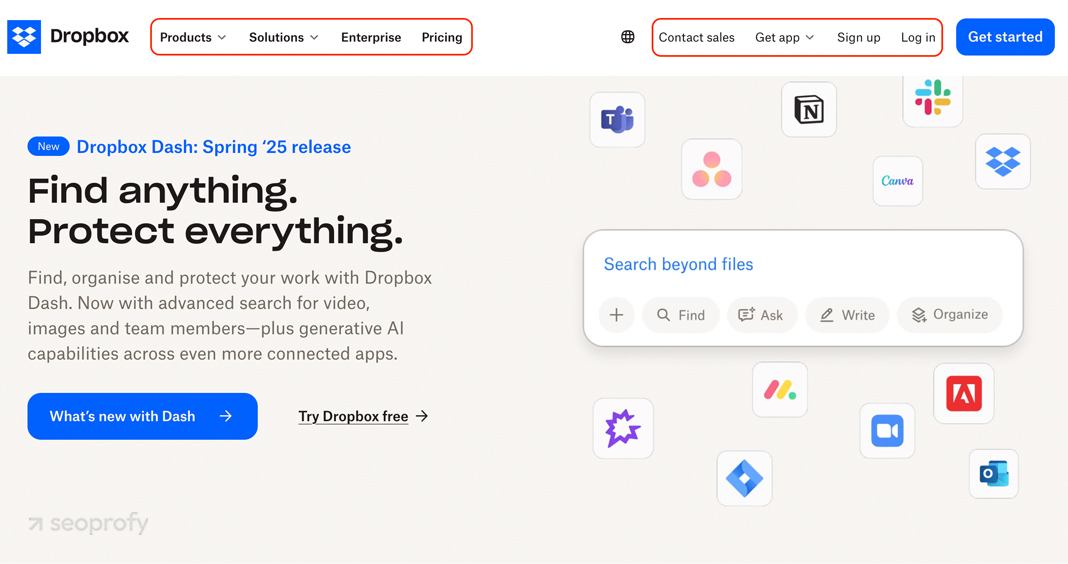
The simpler your structure, the easier it is for search engines and users to move through. So, try to keep the main pages in your top menu, use easy-to-understand labels, and don’t overcomplicate it with too many dropdowns or filters. Just like Dropbox does:
Your internal linking works alongside that structure. It gives visitors clear paths to continue reading and helps search engines find and evaluate pages that might not be as prominent in your navigation. Use it strategically to point people toward related content and support pages that could use more visibility.
UX Mistakes that Hurt SEO
Now that you know how a positive user experience can help your SEO rankings, let’s talk about common mistakes that work against you. These are the design and content choices that are better to avoid if you want your site to perform well in the Google search results.
Keyword Stuffing that Ruins Readability
Search terms and keyword research overall are important parts of both UX and SEO. But a common mistake many businesses make is trying to fit in too many phrases at once, which often clutters the sentences and makes the content harder to read. It doesn’t help your rankings either because keyword stuffing goes against Google’s spam guidelines. So it’s bad for your visitors and visibility in search, too.
Rather than cramming in every variation, choose relevant keywords that match what your audience is likely to type into a search bar. Use them where they make sense, and support them with related terms (sometimes called LSI keywords) that add more context.
Carousels and Excessive Interactions
Carousels are a common design element, especially in ecommerce. But they rarely improve performance. In most cases, they slow down your page speed and bury important content behind slides that users don’t interact with.
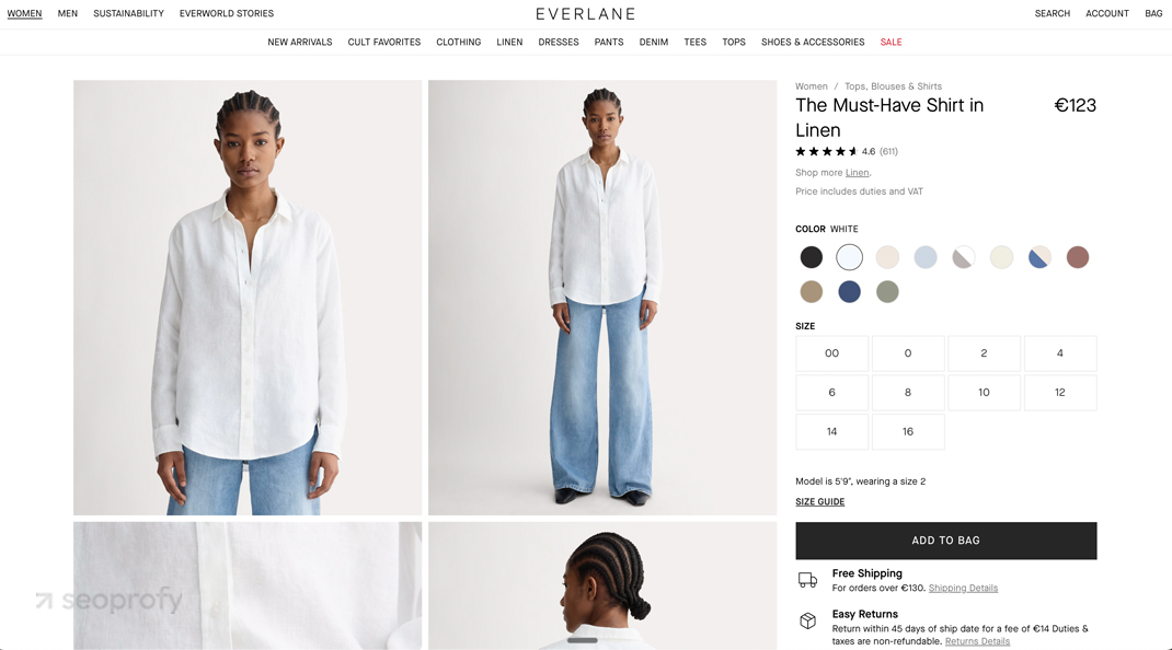
From a content strategy perspective, it makes more sense to use static images or infographics paired with optimized copy. This gives users the information they need right away, without forcing them to swipe or click through distractions. It also makes the page faster and easier to scan. Here’s an example of how Everlane does it:
The same goes for pop-ups, sliders, or elements that require too much clicking or hovering. These design choices often feel distracting or slow your visitors down as they make it harder for mobile users to find information. A much better choice is simple layouts that let people scroll naturally through your content.
Hidden CTAs and Unclear Navigation
When visitors land on your site, they don’t know what the next step is. If they can’t spot a button that shows them where to go, they’ll likely leave without doing anything. For this reason, your main button should be visible, easy to reach, and designed in a contrasting color.
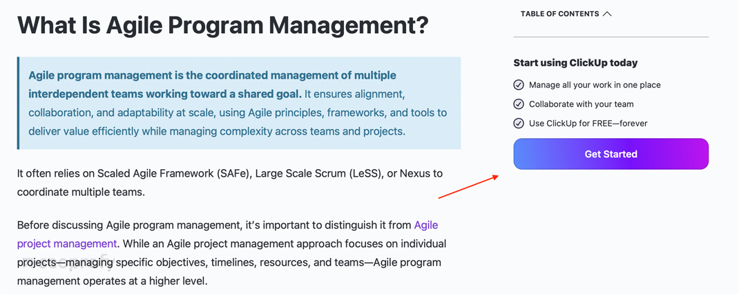
ClickUp’s website is a great example. Their “Get started” button is easy to find and sticks to the screen. So, no matter how far their readers scroll, it’s always there to guide them towards the next step.
The same goes for your navigation. People expect to find your main pages, like pricing or contact, in your menu right away. Too many items or tucked-in pages only slow them down.
So, when working on UX and SEO, always think about your visitors’ mental models and goals. What are the key pages they might try to find? You can ask them directly, if possible, or look at your internal search bar data. This will give you a better sense of which pages to add to the top menu.
Accordion/Zippy Content Misuse
Even though accordions offer several advantages for SEO through better content organization, their implementation may present issues that impact a site’s performance in search engine results pages.
The main problem is that these design elements hide important content behind extra clicks. So when overused, they can increase the interaction cost and make users work harder to find what they need.
To not let this happen, keep accordion headers concise and descriptive. Here’s how Ikea does it on their product pages:
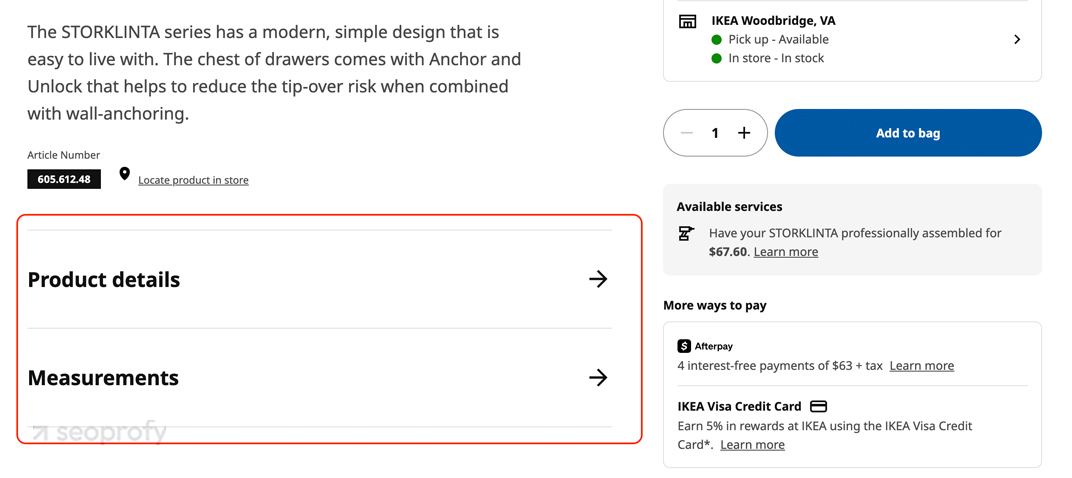
Additionally, limit the amount of content inside each section, and make sure it’s accessible with proper keyboard navigation and screen reader support.
Tools that Help You See UX in Action
The good news is, there are plenty of tools that let you track how people move through your site. They show where visitors click, how far they scroll, and where they lose interest. This helps you move away from guesses and make design changes that will positively impact your UX and SEO.
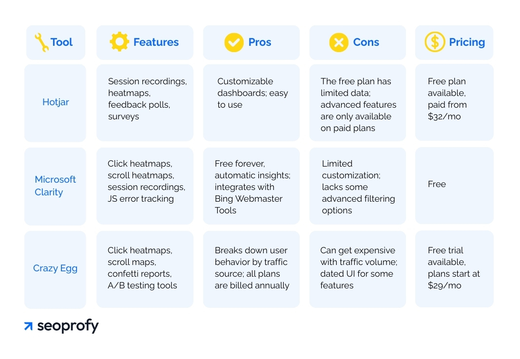
Heatmap Tools (Hotjar, Clarity, Crazy Egg)
Heatmaps give you a visual view of what people do on your pages. They highlight the areas where website visitors spend most of their time, where they drop off, and what places they miss entirely. Such data helps you make better choices around your UX and digital marketing efforts.
As for the tools, Hotjar, Microsoft Clarity, and Crazy Egg are some of the most popular options for this. We’ve created a quick table for you, so you can see how they compare.
|
Tool |
Features |
Pros |
Cons |
Pricing |
| Hotjar | Session recordings, heatmaps, feedback polls, surveys | Customizable dashboards;
easy to use |
The free plan has limited data; advanced features are only available on paid plans | Free plan available, paid from $32/mo |
| Microsoft Clarity | Click heatmaps, scroll heatmaps, session recordings, JS error tracking | Free forever, automatic insights; integrates with Bing Webmaster Tools | Limited customization; lacks some advanced filtering options | Free |
| Crazy Egg | Click heatmaps, scroll maps, confetti reports, A/B testing tools | Breaks down user behavior by traffic source; all plans are billed annually | Can get expensive with traffic volume; dated UI for some features | Free trial available, plans start at $29/mo |
You can test each of these tools to see which one fits your needs best. If you’re optimizing your site for both Google and Bing, then Microsoft Clarity can be a good option. It’s free to use and integrates well with Bing Webmaster Tools.
Scroll Depth and Click Analysis for SEO Content
Heatmaps are great for getting the big picture of UX and SEO, but if you want to understand how far people read, scroll depth data is what you need. The same tools we mentioned earlier include this feature, so you won’t need to look for any additional software.
In Hotjar, it’s called scroll maps. They show you where visitors stop scrolling on your pages. This is useful for long-form SEO content like guides, landing pages, or service pages because you can see the drop-off points and where people lose interest.
Click analysis works in a similar way. It helps you see which links people click inside your content. This can reveal if your internal links get any attention or if important CTAs are being ignored.
Both scroll depth and click analysis help you fine-tune your content layout. You can move your CTAs higher up the page if nobody clicks on them, improve your introductions to hook readers earlier, or remove sections that readers don’t engage with. Still, what you learn from scroll or click data can shift depending on the device, so it’s important to analyze mobile and desktop data separately.
Engagement and Bounce Rates by Device
In most cases, your content won’t perform the same way across screen sizes, and knowing where those differences happen helps you design better pages and layouts.
Again, tools like Microsoft Clarity and Hotjar have the functionality to help you track these metrics. You can filter session recordings and heatmaps by device type. This will let you compare scroll depth and click behavior between mobile, tablet, and desktop users to see which layouts or sections work best on each screen.
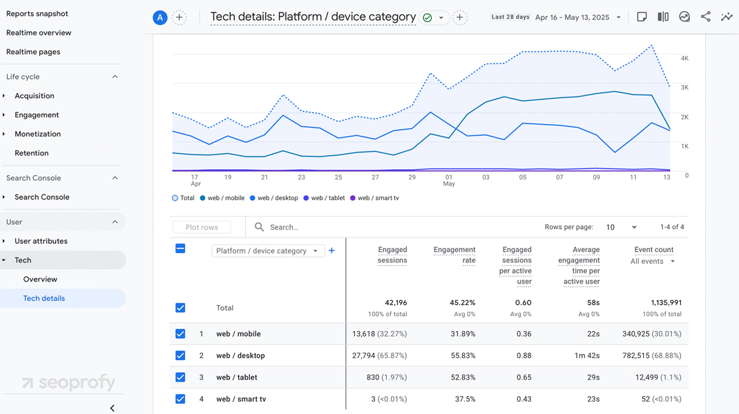
Another helpful tool you can use for this is Google Analytics 4 (GA4). If you navigate to Reports > User > Tech > Tech details, you’ll find metrics like active users, average engagement rate, and event count. This shows which layouts hold the attention of your visitors and which ones might be too hard to use on smaller screens.
Regional & Cultural UX Expectations
People experience websites differently depending on where they live. Their culture influences how they read your pages, what they expect to see in your navigation, and how they move from one section to another.
So if you’re trying to rank and convert in different markets, the UX and SEO of your site has to feel familiar to the people using it. When the layout, tone, and flow match how they normally browse, users move through your site more easily and are more likely to trust you as a brand.
To understand it better, let’s take a look at two areas where those differences are the most important: layout and navigation.
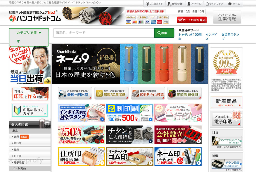
Japan vs. US: Dense, Information-Rich vs. Minimalist Layouts
In Japan, websites are often packed with text, banners, links, and images all in one place. They focus on immediate user engagement. It might seem overwhelming to someone from the US, but it makes sense for them.
Japanese users are used to scanning more information at once. It gives them everything they need without clicking around. Here’s an example of a Japanese website.
In the US, it’s more text-based. Most pages lean toward minimal design with fewer elements, more space, and one goal per screen. The idea is to simplify the path and guide people through one step at a time, just like in the example below.
These differences show that your site needs to cater to the cultural expectations of the countries you plan to target. If the user interface and layout of your site feel unnatural to them, it can create friction that will result in high drop-offs, low adoption, and a possible withdrawal from the market.
Language and Navigation Patterns
If you’ve ever seen Chinese characters, you can guess that typing in them takes longer than in English. This influences how people search and how they expect content to be structured. In many Chinese websites and apps, users lean more toward scrolling and tapping than typing out queries.
That shift affects both UX and SEO. From a UX perspective, it means users need more entry points and more visible options on the page. From an SEO standpoint, it changes how people discover content — there’s less reliance on search bars and more on homepage layouts, categories, and internal links that guide users through.
Navigation design also changes between countries. In Western apps, menus often sit behind icons like the hamburger menu or three dots. In China, apps like WeChat use a compass icon labeled “Discover.”
For international SEO and UX, this means design patterns, labels, and even homepage structure should follow what people are used to in that region. Familiar flows increase interaction and help your content surface more naturally, whether users are searching or just browsing.
Final Takeaway: SEO Without UX Is Incomplete
UX influences more than how people feel about your site. It affects how they use it, how long they stay, and how likely they are to click, scroll, and eventually convert. These actions send signals that tie directly into how your pages perform in search.
For search engines like Google, these metrics are just as important as technical SEO and are indicators of quality and user satisfaction. Overall, sites designed with UX in mind tend to perform better not only in traffic, but in how visitors interact and convert once they arrive.
On that note, if you’d like a second set of eyes on your UX SEO, we can help. At SeoProfy, we offer an SEO audit to help businesses pinpoint issues that might be holding them back. You’ll get a report with insights on what to fix and how to make your site work better for both search engines and real people.

Bohdan has been an SEO analyst at SeoProfy for more than two years. He began his career in digital marketing in 2019 and has since gained experience helping scale some of the world’s leading brands in industries such as gambling and SaaS. Bohdan specializes in developing effective strategies tailored to specific regions.